NDTP Rebrand
BRANDING | TYPOGRAPHY | GUIDELINES I DIGITAL DESIGN
navigatebydesign were commissioned by the the National Doctors Training and Planning under HSE to rebrand their existing identity. navigatebydesign work closely with the NDTP on a number of their publications such as their Strategic Reports and Annual Reports, giving us a deeper understanding of our clients preferences.
The Challenge
The new branding needed to take the emphasis away from training and appeal more to doctors. It was felt that brand name also needed to be more prominent and recognisable. A key challenge with this was how to feature a long brand name such as ‘National Doctors Training and Planning’. A purely typographic approach was required, as medical symbols such as snakes, crosses etc. could be misrepresentative.
It was important that the new branding would have a premium positioning and convey authority and confidence, yet still be approachable. Additionally, the new branding needed to build engagement and a sense of pride with its members – high value NCHDs, consultants and other specialists.

The Solution
navigatebydesign worked closely with our client and their Senior Management teams to further define the brief. As part of this we developed a framework for key messaging, brand positioning and the brand promise.
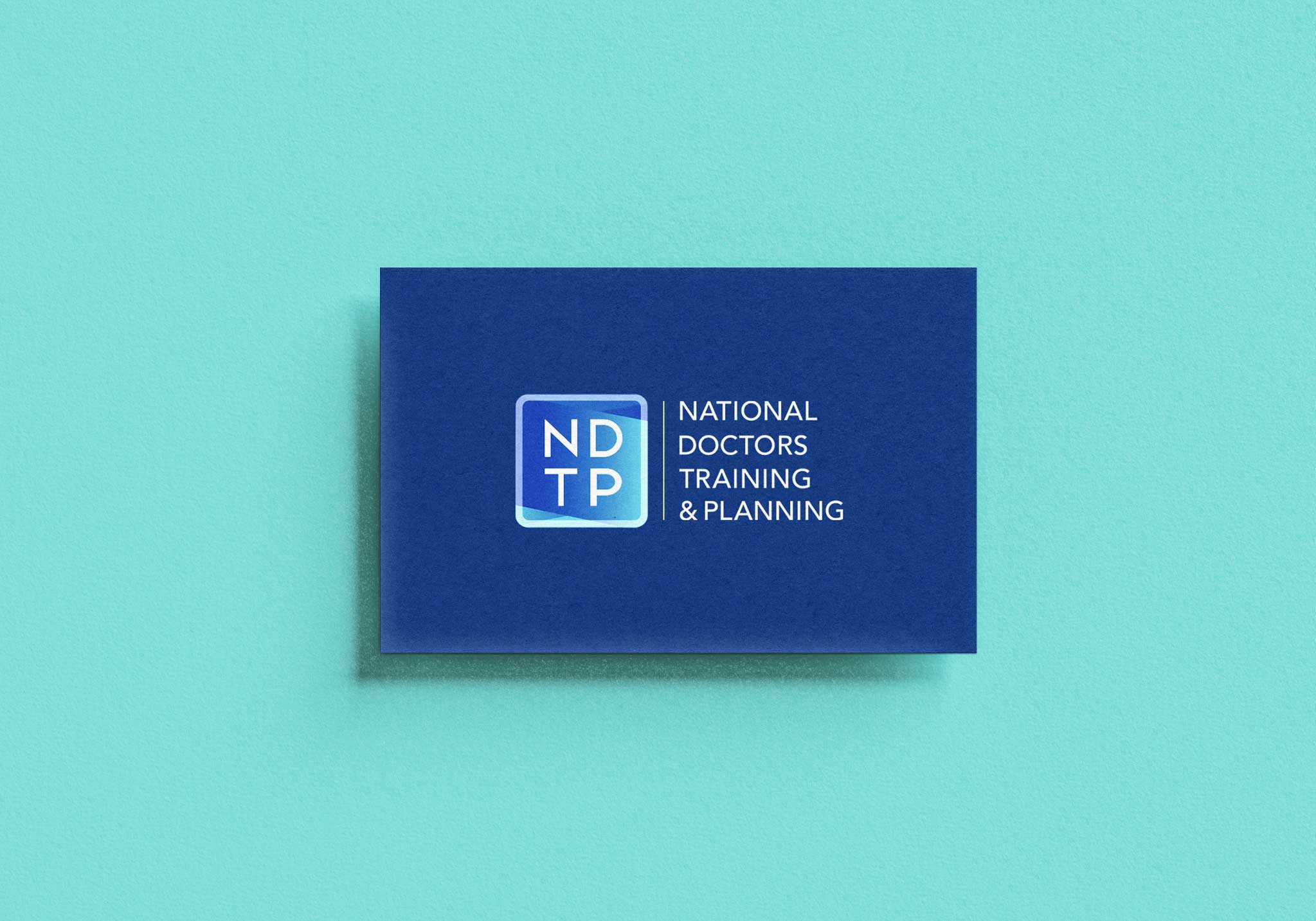
The selected brand NDTP brand features a cube symbol which has a semiopaque frame and houses the acronym NDTP. The cube symbol sits alongside the stacked brand name ‘National Doctors Training and Planning’. There is a divider line linking these two elements.
The shapes behind the NDTP letters overlap each other to give the brand depth whilst also suggesting care and support. The shapes help to reinforce the brand promise statement of ‘empowering our doctors to be their best’.

Implementation
The new branding was rolled out to brand guidelines, lanyards, reports, merchandising, website branding and social media posts.
The new branding helped to elevate the NDTP’s positioning, solidifying its image as a premium organisation. Members felt a stronger sense of belonging and association with the brand’s values.


More Projects
Let’s Work Together
If you feel your branding or design could work harder for your business,
why not schedule a consultation with navigatebydesign.
Fill out the quick contact form below and let’s start the conversation.


